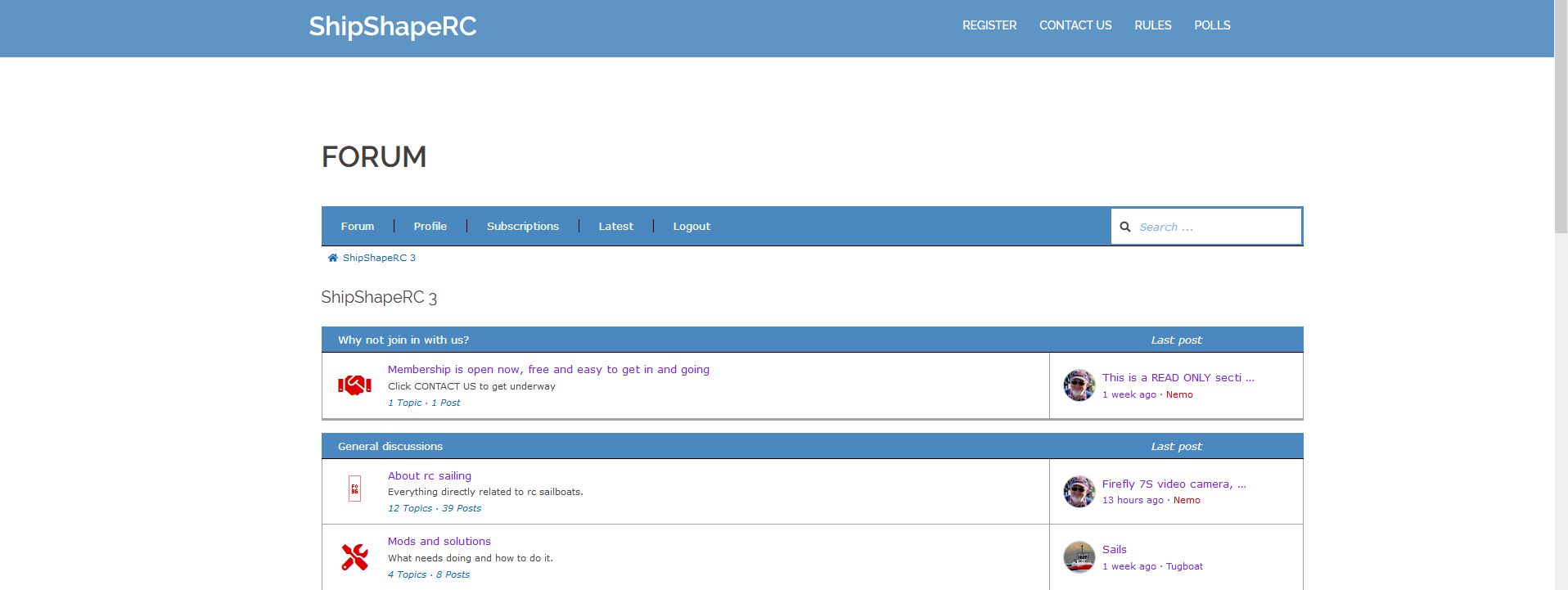
Site not responsive
Quote from nemo on July 4, 2019, 1:14 amBear with me on this one as I am unfamiliar with such.
But what I’m looking to achieve is to make my site viewable by default on mobiles. As it is you need to manually resize the mobile screen which doesn’t seem ideal at all, nor permanent.
I have used the code supplied in another topic to increase the page width, maybe this is responsible?
It may be the theme I’m using, Sydney [Free] and if so, do I need to change to another? most of my viewers use desktops, or tablets, but I think it would be best if anyone can view normally.
Bear with me on this one as I am unfamiliar with such.
But what I’m looking to achieve is to make my site viewable by default on mobiles. As it is you need to manually resize the mobile screen which doesn’t seem ideal at all, nor permanent.
I have used the code supplied in another topic to increase the page width, maybe this is responsible?
It may be the theme I’m using, Sydney [Free] and if so, do I need to change to another? most of my viewers use desktops, or tablets, but I think it would be best if anyone can view normally.
Uploaded files:Quote from Asgaros on July 4, 2019, 10:41 amHello @nemo
Asgaros Forum is responsive by default and there should be no problems when visiting your forum on mobile-sites. I checked out your website and it seems that your theme is not switching to a mobile-friendly-version.
I suggest you to switch to another theme for testing purposes to verify that this issue is caused by your theme. As you maybe see in this forum it normally should look fine when you visit it with a smartphone.
Hello @nemo
Asgaros Forum is responsive by default and there should be no problems when visiting your forum on mobile-sites. I checked out your website and it seems that your theme is not switching to a mobile-friendly-version.
I suggest you to switch to another theme for testing purposes to verify that this issue is caused by your theme. As you maybe see in this forum it normally should look fine when you visit it with a smartphone.
Quote from nemo on July 4, 2019, 10:34 pmThanks for that.. I went hunting for theme support and found others having the same problem.. Their support offered some code (quite a lot of it) which I replaced the few lines I had in extra CSS to change the screen width..
This what they suggested for appearance problems..
@media only screen and (min-width: 992px) and (max-width: 1199px) {
#panel-w5afa20c34766b-1-0-0 > .panel-widget-style {
height: auto !important;
}
#panel-w5af90a6762b49-0-0-0 .panel-widget-style {
padding: 22px 30px !important;
}
#panel-w5afa20c34766b-1-0-0 > .panel-widget-style h2 {
font-size: 25px;
margin-bottom: 18px;
}
#pg-w5af90a6762b49-1 > div {
padding-top: 0 !important;
}
}
@media only screen and (min-width: 781px) and (max-width: 991px) {
#panel-w5afa20c34766b-1-0-0 > .panel-widget-style {
height: auto !important;
}
#panel-w5afa20c34766b-1-0-0 > .panel-widget-style h2 {
font-size: 20px;
margin-bottom: 18px;
}
#panel-w5af90a6762b49-0-0-0 .panel-widget-style {
padding: 5px 10px !important;
padding-bottom: 0 !important;
}
#pg-w5af90a6762b49-1 > div {
padding-top: 0 !important;
}
#panel-w5af90a6762b49-1-0-0 .ow-button-base > a {
padding: 8px 20px !important;
}
}
And, yes, it works just fine. Maybe more than needed, but it looks good to me.
Thanks again.
Thanks for that.. I went hunting for theme support and found others having the same problem.. Their support offered some code (quite a lot of it) which I replaced the few lines I had in extra CSS to change the screen width..
This what they suggested for appearance problems..
@media only screen and (min-width: 992px) and (max-width: 1199px) {
#panel-w5afa20c34766b-1-0-0 > .panel-widget-style {
height: auto !important;
}
#panel-w5af90a6762b49-0-0-0 .panel-widget-style {
padding: 22px 30px !important;
}
#panel-w5afa20c34766b-1-0-0 > .panel-widget-style h2 {
font-size: 25px;
margin-bottom: 18px;
}
#pg-w5af90a6762b49-1 > div {
padding-top: 0 !important;
}
}
@media only screen and (min-width: 781px) and (max-width: 991px) {
#panel-w5afa20c34766b-1-0-0 > .panel-widget-style {
height: auto !important;
}
#panel-w5afa20c34766b-1-0-0 > .panel-widget-style h2 {
font-size: 20px;
margin-bottom: 18px;
}
#panel-w5af90a6762b49-0-0-0 .panel-widget-style {
padding: 5px 10px !important;
padding-bottom: 0 !important;
}
#pg-w5af90a6762b49-1 > div {
padding-top: 0 !important;
}
#panel-w5af90a6762b49-1-0-0 .ow-button-base > a {
padding: 8px 20px !important;
}
}
And, yes, it works just fine. Maybe more than needed, but it looks good to me.
Thanks again.
Quote from nemo on July 26, 2019, 9:00 amYes, theme is, but earlier additional code to make the display wider got in its way. Removed that and all’s well.
Topic now closed. 🙂
Yes, theme is, but earlier additional code to make the display wider got in its way. Removed that and all’s well.
Topic now closed. 🙂

