Next button color issue
Quote from Ron Rollo on June 27, 2023, 9:23 pmHello,
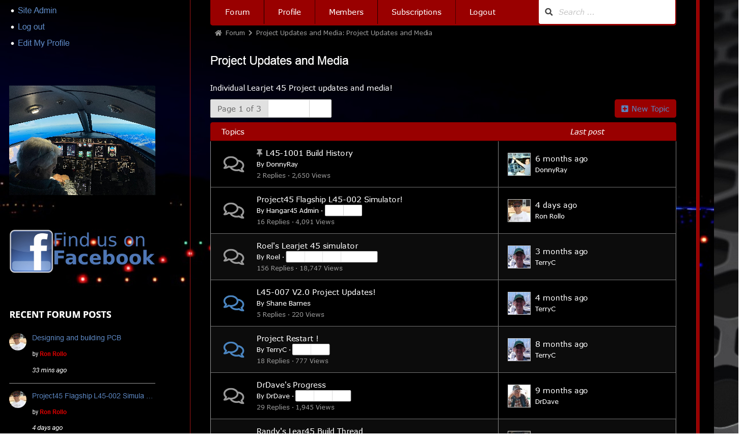
Over the past few days I have noticed some minor color issues to some of the buttons in the forums, most likely related to some recent updates. The best way to describe what is happening is with a screen shot.
The “NEXT” buttons and multi page buttons are all whited out. I took a look in the Forum “Appearance” page and I don’t see any options for buttons like this. (I am still looking around in case I am missing it)
I know the biggest part of my problem is having a dark background and white text but up until now, the forum has been looking and operating great. My guess is I need a bit of code to drop in the Custom CSS box but don’t have a clue as to what that would be.
Any help would be greatly appreciated.
Best Regards,
Ron
Hello,
Over the past few days I have noticed some minor color issues to some of the buttons in the forums, most likely related to some recent updates. The best way to describe what is happening is with a screen shot.

The “NEXT” buttons and multi page buttons are all whited out. I took a look in the Forum “Appearance” page and I don’t see any options for buttons like this. (I am still looking around in case I am missing it)
I know the biggest part of my problem is having a dark background and white text but up until now, the forum has been looking and operating great. My guess is I need a bit of code to drop in the Custom CSS box but don’t have a clue as to what that would be.
Any help would be greatly appreciated.
Best Regards,
Ron
Uploaded files:
Quote from Asgaros on July 11, 2023, 9:03 amHello @ron-rollo
Sorry for the late reply. Can you provide me a link so I can quickly check the issue?
Hello @ron-rollo
Sorry for the late reply. Can you provide me a link so I can quickly check the issue?
Quote from Ron Rollo on July 11, 2023, 5:23 pmHi Thomas,
No worries. It looks like your support forums are keeping you busy!
Here is a link to one of the sub forums:
https://hangar45.net/hangar-45-forum/forum/project-updates-and-media
I played around with the color options and found something that would work. At least now the “NEXT” button and others like it are not whited out, however, I would like to modify a few other things, or at least have the option to do so.
I think the thing that will help guys like me with a blacked out backgrounds and predominantly white text is to add additional options to change colors to specific buttons rather than an all inclusive option to change all button colors. This might be a cool option for folks with lighter color backgrounds and darker text too.
It’s a “wish list” item for me and a “rainy day” item for you.
Thanks as always Thomas for providing an incredible forum!
TTYS,
Ron
Hi Thomas,
No worries. It looks like your support forums are keeping you busy!
Here is a link to one of the sub forums:
https://hangar45.net/hangar-45-forum/forum/project-updates-and-media
I played around with the color options and found something that would work. At least now the “NEXT” button and others like it are not whited out, however, I would like to modify a few other things, or at least have the option to do so.
I think the thing that will help guys like me with a blacked out backgrounds and predominantly white text is to add additional options to change colors to specific buttons rather than an all inclusive option to change all button colors. This might be a cool option for folks with lighter color backgrounds and darker text too.
It’s a “wish list” item for me and a “rainy day” item for you.
Thanks as always Thomas for providing an incredible forum!
TTYS,
Ron
Quote from Asgaros on July 13, 2023, 5:46 amHello @ron-rollo
I see, yeah I probably have to provide some additional styling options. Also I try to gradually simplify and unify certain design-elements because I feel some parts have their own look-and-feel and lead to an inconsistent experience at some point (which you obviously observe when you start to change the colors). I will think about it and see how I can improve it further.
Hello @ron-rollo
I see, yeah I probably have to provide some additional styling options. Also I try to gradually simplify and unify certain design-elements because I feel some parts have their own look-and-feel and lead to an inconsistent experience at some point (which you obviously observe when you start to change the colors). I will think about it and see how I can improve it further.
Quote from Ron Rollo on July 13, 2023, 2:22 pmThanks Thomas,
It’s an incredible and powerful forum as it is. But like anything worth the effort, there is always room for enhancements. That’s what makes this forum great, your continuous support!
I will keep an eye out for future updates.
Thanks again Thomas!
Thanks Thomas,
It’s an incredible and powerful forum as it is. But like anything worth the effort, there is always room for enhancements. That’s what makes this forum great, your continuous support!
I will keep an eye out for future updates.
Thanks again Thomas!
